Skip to content
Author Micah Cambre

managing retrospective

I was just updating my tech i know and tech i use pages. It strikes me how far I have come since I started those pages and a lot of the i don’t know… section now belongs in the i’m learning section.

Also, my interests in web development and web design have matured. Today, I want my focuses to be on the design side of development, still very much the front-end, creating design systems, pattern libraries, and component libraries as well as supporting user interfaces for the web. This is a huge rabbit hole of technology that bleeds into everything from performance, accessibility, web components, libraries, frameworks, and so much more.

With all of this in my focus, where do I stand today?

best of both worlds

I’ve worn a lot of hats in the last decade of my career, most recently the hat of an engineering manager. There’s a point where you go from being a senior developer, who’s been in the throw of code and development for much of his or her career, and decide on how to move forward either with more contributor roles or with management roles. In fact, engineering management is a parallel track to engineering or development, it’s helpful to lead by example, when there’s time and availability.

As a manager, my strengths are in the collaboration and partnerships that are needed and required to move forward. I bring a lot of passion into the positions I take on various projects or ideas. In fact, I can be so eager to move an idea forward and the controlled chaos that ensues. As a product strategist, there’s so much potential to look for optimizations and efficiencies to get things done. In my last year of management work alone, I’ve come a long way to move the needle in the right direction, looking for compromise and yet pushing for effective outcomes.

I find it satisfying to put in any time I can on both coding and managing where it makes sense, where my abilities best serve the team. As a manager, I make a conscious effort to not to move the needle for a project. It’s my number one job to enable and support the lead developer/engineer to make these moves.

we are all designers

One of the main takeaways from the various projects I was involved with the last few years of my career is that the software development life cycle (SDLC) that we all know is pretty out of date. In so many companies, There’s still this mentality of waterfall models, hand offs, where all the concerns and ownerships are still so isolated from each other.

What I never really understood, but I feel is crystal clear today, is we’re all involved in the design phase of the SDLC. Our primary concern, regardless of content, components, code, copy, creations (how many Cs can you think of? :) is the design of everything. In the spirit of my interests at the beginning of this writing, we should all be talking to each other from the very beginning. Content people are writing primarily for what they know, but if they could talk about the user journeys from a design and development perspective, in addition to content management or SEO, it might unlock new potentials for what the most effective content is.

As a designer, we should also have the ownership to create in the medium we publish. This means relieving ourselves from leaning on a lot of abstract tools. What if we were all able to start and finish a project inside of the same, exact tool? Just as our desktops should get out of our ways to create, so should our tools get out of our ways to produce.

Each stakeholder, each expert in their domain, should have the autonomy to do their job. We all need a sense of ownership and agency in the work we produce. At this point, however, we shouldn’t be isolated or siloed in how we move together. You work with a team, move as a team, and succeed as a team.

the ideal

If there was anything that could feel the most relevant to my career, it would be to improve the SDLC to focus everything around the design experience, to congregate teams to use the same product from end-to-end of the cycle, and to heavily focus on systems. Web teams should put as much energy and focus into design systems as possible, encircling this idea with all the libraries and guides needed to move a product cycle forward.

The most efficient path is the one where all the stakeholders are included in the same suite of software and products to deliver results efficiently and effectively. We shouldn’t be waiting on each group to completely finish their work; how many times have I waited first on content managers, THEN on designers, THEN on project managers, etc, etc., before being able to move on code. So much wasted time and lots of problems delivered to the developers! Hand offs were kind of effective in the years past, but today’s agile environment needs more collaboration and teamwork.
typescript, graphql and wordpress

I took a few days to reacquaint myself with GraphQL the last few days. It’s hugely popular with developers as a way to efficiently work with data, providing an efficient way to get a specific set of data to use in a code base. It’s compelling once you understand how to use it.

So I went ahead and installed WPGraphQL, on a WordPress instance I have, to put my feet on the pedals and begin riding. For a few months, I was contemplating creating a custom-built look to a website, and I also wanted to try out using Astro. This was a good opportunity.

It’s trivial to set Astro up, running:

npm create astro@latest

It asks if I want to use TypeScript, so sure, why not. I’m familiar with it, this’ll give me more experience to use it, all it’ll do is take up more time if it’s not easy to put together.

Okay, so then I begin setting up a very simple couple of template files in Astro.

+ src
  + data
    </> wordpress.ts # This is where I fetch the data
  + layouts
    </> default.ts # This is the baseline application wrapper
  + pages
    + blog
      </> [slug].astro # Blog post
    </> index.astro # Blog roll 

Getting to this point wasn’t too difficult, just following the steps and updating to my project. The head scratcher comes from the actual TypeScript that’s required.

Here’s the blog roll code.

---
import	Layout from '../layouts/default.astro';
import { wpquery } from '../data/wordpress';

const data = await wpquery({
	query: `
		query LoadAllPostsExcerpt {
			posts {
				nodes {
					title
					slug
					excerpt
				}
			}
		}
	`,
});
---

<layout title="Test">
	<h1>Posts</h1>

	{
		data.posts.nodes.map((post: any) => {
			return (
				<article class="post-preview">
					<h2>
						<a href={`/blog/${post.slug}`}>{post.title}</a>
					</h2>
					<fragment set:html={post.excerpt}></fragment>
					<a href={`/blog/${post.slug}`}>read post →</a>
				</article>
			)
		}
	)}
</layout>

Here’s the focus of this code: data.posts.nodes.map((post: any) => {...}.

There’s nothing simple in WordPress about declaring a type on various data, like post: any. In my code, I’ve resorted to the data type any so many times it becomes pointless to continue using TypeScript.

So I have looked all over for a solution. It exists, of course, but from what I can see, it’d look something like post: Post after having to add another abstraction to define what is Post. Tedious and silly, if you ask me.

Already using TypeScript is an abstraction, one I’m finding to not be so useful.

With the above said, let me end this with a general headless WordPress confusion. The future of WordPress, clearly, is Gutenberg. However, according to the author of WPGraphQL,

“[…] much of WordPress was built with decoupling in mind, the WP REST API and Gutenberg were not.”

In fact, it’s worse than this for anyone using modern WordPress using Gutenberg.

“Gutenberg didn’t have a server-side registry for blocks. At this time, all blocks in Gutenberg were fully registered in JavaScript, which is not executed or understood by the WordPress server.

This means that unlike Post Types, Taxonomies, Meta, Sidebars, Settings, and other constructs that make up WordPress, Gutenberg blocks don’t adhere to any type of contract with the WordPress server.

This means that the WordPress server knows nothing about blocks. There are no agreements between Gutenberg blocks and other systems in WordPress, or systems trying to interact with WordPress via APIs.

Blocks were practically non-existent as far as the application layer of WordPress was concerned.”

So this means, if I have decided that Block Themes and Full-Site Editing is the future and I want to support it, and I also want to go headless, I’m in for a world of pain.

Are developers truly going to continue supporting or going with WordPress unless/until they fully get on board with Block Themes? I don’t think I can see myself continue with WordPress as it’s moving forward. With its forced use of React for Gutenberg, to the weird ways you have to set data, attributes, styles, or other options, this looks like a complete lock-in to a specific way of building websites. Maybe this is great for some, but I am having major doubts I’ll stick this out for much longer.

scss is just css now

Okay geeks, it’s almost January 2024 and, finally, Scss is now CSS.

Okay, not all of it, but primarily the biggest feature everyone uses.

Nesting.

That’s what we’re all using Scss for, right?

Right? Don’t lie…

Okay, let’s say we ditch Scss, as you should. Seriously, you should.

Do we… keep splitting CSS into lots of files like we did Sass?

Think about it, we take out the abstractions of Sass rules, we ditch the Sass build scripts, right?

Are we delivering lots of files now?

social fracture

Today, I was able to try out Bluesky, the Twitter ripoff. It’s very faithful if you’re used to Twitter.

I’ve been using Mastodon, lightly, for most of the year. It’s where the most relevant chatter was since Twitter’s fracture.

By a miracle, and help from OldTweetdeck, I’m still running the previous version of Tweetdeck for now. It’s on life-support and could die at any time.

Besides the light use of Facebook and Instagram, and having signed up for Pixelfed but not really using it, it’s a weird time for social media in 2023.

To recap:

  • Twitter is dying. Its owners want it to be called ? but nah, not gonna do that
    • Tweetdeck still serves its purpose for me, a general idea of what Twitter people are saying, but it’s far more conservative hyperbole now. However, still my social attention spend
  • Facebook serves people older than 30 crowd just fine, I guess, but I am allergic to its slurping up of all data to do who knows what. No thanks
  • Instagram is barely useful, mostly for the Stories feature, but just not much to enjoy beyond that
  • I wanted Pixelfed to replace Instagram, giving me control back, but I just haven’t committed
  • Mastodon is the 2nd primary attention and most of my posts, which still isn’t a lot
  • Nostr, well, is really so niche right now, you probably haven’t heard of it. But, for the few notable people I see there, and can’t really see elsewhere, it’s slightly interesting
  • Bluesky is not really gonna be much for me until I get a Tweetdeck like instant feed refresh tool. I don’t like manually refreshing Bluesky to see new posts, never did about Twitter, eithe

I won’t bother with any other social networks. It’s already too much for me.

Ideally, when magical time and effort appear in my life, I’ll set this site up to just blast out to half the list up there, Indieweb style, and start writing here on this site. Or not. It’s a lot of work, and the UI for WordPress and Gutenberg is not ideal, whether with Classic Editor or Gutenberg.

Also, I still have trust issues with the web in general. OpenAI, ChatGPT, all these new 2023 AI services, this site and my content on all the sites above and more have fed into their dataset. It’s annoying.

How do I find a balance here?

just thrown away like that

I had to look it up just now because I don’t remember when I started using it.

It was around May of 2009. I don’t even think it was possible to use you browser to access it, either. It was before iOS had an app.

Twitter didn’t even own it yet!

This was two years after I started using Twitter in March of 2007; Twitter permitted for us to sign up at SXSW that year so I was an early user even though I didn’t really understand its utility and it was still finding its place.

Tweetdeck is how I primarily interacted with Twitter all this time. It’s consistent. It provided near real-time updates without me refreshing. It’s my go to, to see how the public is reacting.

Then, this past Sunday, it was yanked away from me and replaced by the new version. A version that’s going to be locked down behind a paywall after the end of July. And this new version just doesn’t compare or stand a chance.

Sure, I have other ways to figure all of this out. But Tweetdeck was there for me through a long span of my adulthood.

I could see all kinds of people confirming that I just felt an earthquake. I got to know smaller personalities who weren’t well-known. I also could see what celebrities were thinking. So many pointless brands hawking to get my attention.

It was always there. I learned a lot. I was always entertained.

If it’s locked up and thrown away from me, so be it. I won’t miss what it is now.

EDIT July 9 – They are allowing the old version to be used again, but I cam only assume it’ll still be hidden behind a paywall after the end of the month.

relearn using dishwashers

Bookmarked

Detergent packs are kinda wishy-washy (Dishwashers Explained)

I’m writing this post to clear off some of the dust from this site. I’m linking to a YouTube video that goes deeply into using dishwashers and how so many of us have forgotten how to actually use dishwashers well. In fact, we really should stop hand washing too often to conserve water and reduce our bills since dishwashers are so efficient AND effective with less use of everything.

Four steps to effective dishwashing:

  1. Turn on the facet water and let it get as hot as it can. The dishwasher needs this hot water from beginning to end.
  2. Fill the pre-wash cup with detergent. Using a tablet? Drop a tablet into the dishwasher’s bottom. I’m using plain Finish tablets for this
  3. Fill the main wash cup with detergent. This is usually the one with a door that you lock into place until mid way through the cycle. This is where the fancier tablets can be used, but Finish is also just fine
  4. Check your rinse aid level. Do you see any in there? Fill it up, it adds a pop to the cleaning!

And seriously, if you do all four of these steps, you should be seeing a better dishwashing result every time! The biggest benefit you can take away is the pre rinse with both hot water and soap. If you get this right, the rest of the cycles do their job great.

Now, let’s see if this syndicated a nice little Twitter link into a Tweet. I haven’t tested this feature in a while!

custom roms rock

I am loving using an open source android custom rom! I can pick and choose who gets what and I’m in control of everything. This is a game changer. This deserves a blog post…

Good riddance, #chrome. Hello #brave. But forever. I can’t find a reason to install Chrome on any new computer anymore and have removed it from my existing devices.

Replied to Noteworthy Admin CSS changes in WordPress 5.3 (Make WordPress Core)

WordPress 5.3 will introduce a number of CSS changes in WordPress admin. While the necessity to improve wp-admin accessibility was previously raised in several Trac tickets, Gutenberg’s recent inte…

I admire seeing WordPress move forward keeping accessibility as a priority after its misstep in the 5.0 release. These buttons are a continuation of this priority.

However, it’s disappointing to see a block of form controls and buttons that are too close in design aesthetic to each other.

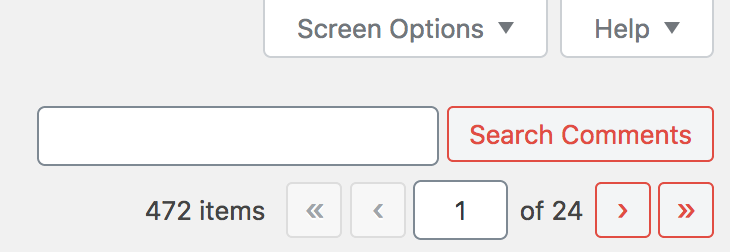
The image I attached in my previous post is what I see on the comments list page in the Dashboard. I see multiple UI and UX problems with the above block.

I could list out the problematic state changes that are hard to see to the nearly identical styles between input fields and buttons. Inconsistent component heights, confusing applied border colors, Midnight Admin Color Scheme active button state on “Search Comments” button being completely red, and more are things I would attribute to not enough QA and testing for this release.

I think this mini-audit above should give you enough alarm to resolve these issues asap, in the next point releases.

wordpress 5.3 buttons are weird

I updated WordPress to version 5.3, saw the changes to the button styles, and then came upon this.

buttons within WordPress 5.3

I like the updated button styles, which in isolation, are transparent background colors with text and borders that are colored. This style works sometimes and is a good contrast from the button styles with solid background colors.

I don’t like that the hover or focus states of these new button styles barely changes. I also don’t like how closely the buttons mirror the form elements. There’s inconsistency in button styles throughout the whole system now with some that use solid background colors and others using transparent background colors.

I’m disappointed in this from a UX perspective. The overall state of WordPress accessibility might have improved in 5.3 but this feels like a regression.

EDIT: It looks like many others share this opinion, in different ways.
https://make.wordpress.org/core/2019/10/18/noteworthy-admin-css-changes-in-wordpress-5-3/